🔮 #BlessingSeries Issue 16 – When Cues Fail: Lessons from a Child, a Cable, and UX Design
A New Month, A Fresh Start
Happy new month, my friend! It’s the 1st of October 2025 — the very first day of the month. Wherever you are in the world reading this, I wish you strength, joy, and clarity in all your endeavors. May this month open doors of opportunity and give you the courage to step boldly into your goals.
And with that spirit of new beginnings, let me take you into a story I experienced just this past weekend, one that left me reflecting deeply on how users interact with our designs.
The Boy, His Mother, and the Cable
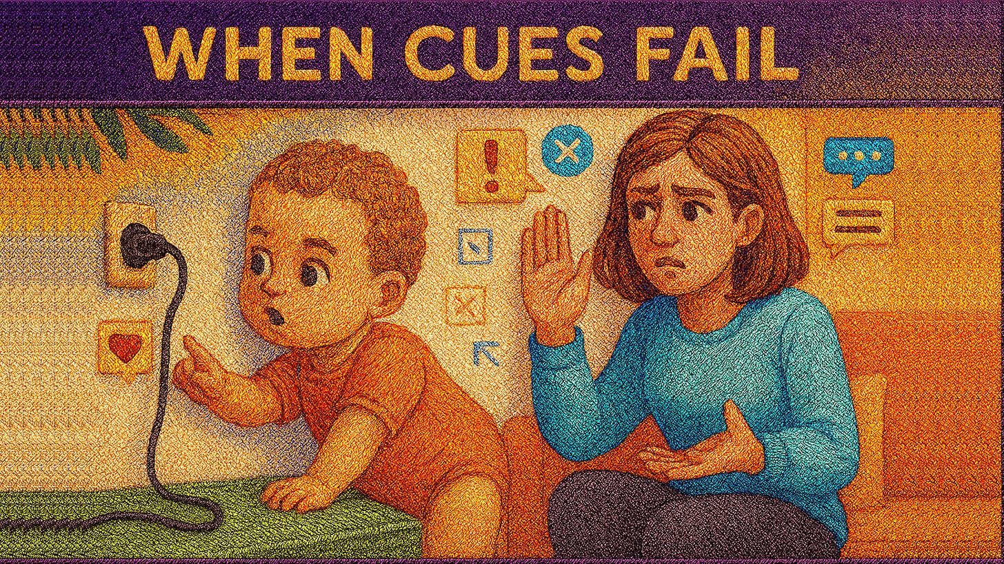
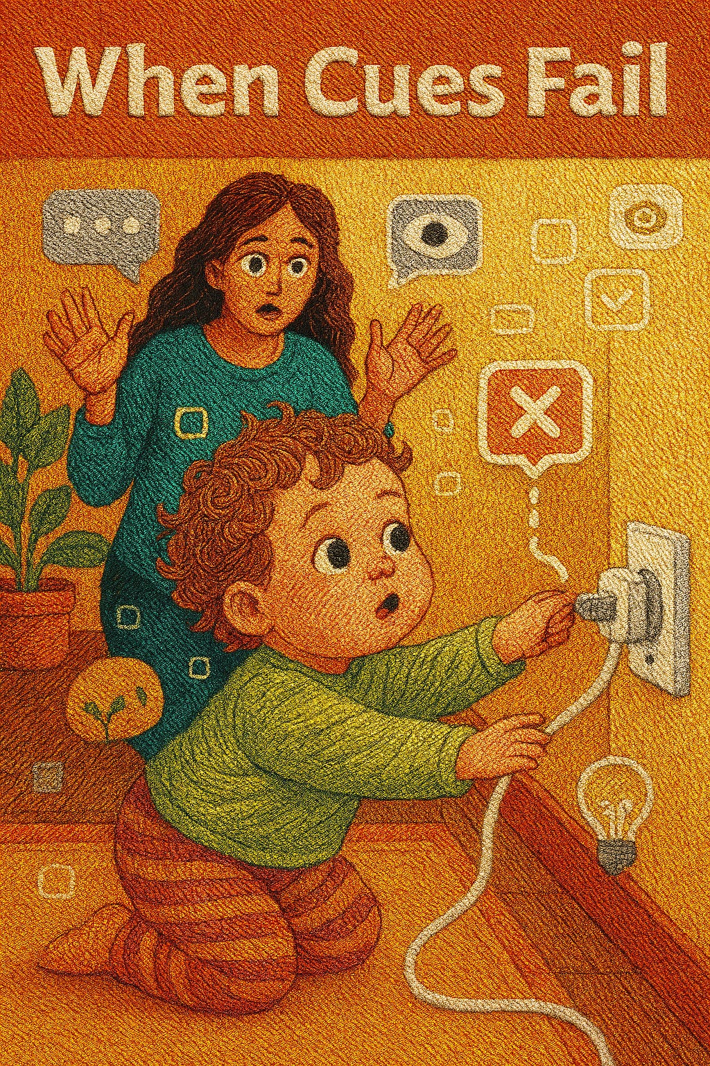
At an event I attended, my attention was caught by a little boy, maybe around 2 years old. Like all curious toddlers, he was drawn to something and in this case, a cable running along the wall.
His mother, sitting a few steps away, noticed it too. With calm but firm precision, she began sending cues.
First, with her eyes, widening and signaling “don’t touch that.”
Then, with her hands, gesturing “come away from there.”
The little boy looked at her. He noticed. But he didn’t follow.
Instead, he stretched closer to the cable.
Finally, the mother had to rise from her seat, walk over, and physically guide him away.
I watched this whole interaction unfold, and something hit me: this is exactly how users often behave in our digital products.
Users Don’t Always Follow Our Cues
As UX designers and increasingly as AI product creators, we believe that cues such as a tooltip here, a blinking button there, a carefully chosen icon over there will guide the user to behave the way we intend. Mmmmmmm 😂🤣
Well, I laugh out loud because that doesn’t usually seem to be the case..... 😂
Yes, just like the mother with her cues, the truth is:
👉 Users don’t always interpret signals the way we expect.
👉 Users don’t always act when we think they should.
👉 Sometimes, no matter how much we design subtle “nudges,” the only effective solution is to step in more directly with clarity.
This lesson is both humbling and powerful.
Case Study 1: When Cues Fall Flat
Years ago, a major tech company launched an ambitious wearable device designed to revolutionize how we interact with information. The product had innovative features, but there was a catch: most people didn’t know how to use them.
Cues like tapping, swiping, or using voice commands were unclear, unintuitive, and awkward in real-world settings.
Many first-time users felt confused, frustrated, or self-conscious using it in public.
Instead of enhancing human experience, the device became a symbol of poor usability.
The product’s downfall wasn’t due to lack of innovation, it was because its cues didn’t match natural human behavior. Users ignored or misinterpreted them, just like the little boy who ignored his mother’s hand and face gestures.
Case Study 2: When Cues Work Well
Now let’s contrast that with one of the most successful product launches in history: the Apple iPhone (2007).
When it debuted, the iPhone introduced gestures like pinch-to-zoom and swipe-to-unlock; cues that were not just intuitive but delightful.
Instead of needing manuals, users discovered gestures through direct manipulation of on-screen elements.
The affordances (buttons looking pressable, sliders looking draggable) guided users without confusion.
These simple, clear cues created immediate adoption and became industry standards.
In fact, a study published in Interactions Magazine, ACM Digital Library highlighted that the iPhone’s onboarding succeeded because it relied on visual metaphors and affordances aligned with natural human behaviors.
This shows us that cues aren’t the problem, it’s whether they match human instincts.
UX and AI: Designing for Human Behavior, Not Just Hopes
These two stories, the toddler with the cable and the contrasting tech product outcomes, bring us to an important question: how do we design products, especially AI-powered ones, when we know users won’t always follow our cues?
Here are three reflections:
1. Subtlety Isn’t Always Enough
The mother at the event started with subtle cues: a glance, a widened eye, a slight movement of the hand. But for a 2-year-old, subtlety is often invisible. The child needed a bigger, clearer signal.
This is exactly what happens in digital products.
A faint icon in the corner may look elegant to the designer, but goes completely unnoticed by the user.
A “hint” buried in microcopy may never be read.
A pulsing dot on a feature might be missed if the user is focused elsewhere.
AI systems often make this mistake too. Think about recommendation engines: they “suggest” quietly on the side, but users may never notice or may not understand why something is suggested.
The takeaway: Sometimes, we must prioritize clarity over cleverness. Big, bold affordances like obvious buttons, high-contrast call-to-actions, or step-by-step onboarding can feel less sophisticated, but they get the job done.
As Don Norman (author of The Design of Everyday Things) puts it, “Good design is actually a lot harder to notice than poor design, in part because good designs fit our needs so well that the design is invisible.”
Invisible cues are only useful if they truly align with instinct. Otherwise, subtlety risks being silence.
2. Context Shapes Interpretation
The little boy wasn’t deliberately ignoring his mother. He simply had a different priority: curiosity. To him, the cable was fascinating. His mother’s widened eyes didn’t mean danger; they were just “mommy looking at me.” 🤣
This is exactly how users approach our apps and AI tools.
One user might see a blinking button as urgent.
Another might see it as spammy or annoying.
A third might not notice it at all because they are tunnel-visioned on their goal.
In UX, context is everything. For instance:
A “Skip Intro” button on Netflix is a gift when you are binge-watching, but in a tutorial app, skipping could leave a new user completely lost.
AI chatbots that prompt with “Would you like me to help?” can feel supportive to one person but intrusive to another.
AI can help bridge this by learning patterns of user behavior. Imagine:
A fitness app notices you always skip long explanations, so it shortens instructions for you.
A financial tool detects hesitation when you hover over a button and dynamically offers clarification.
💡 The takeaway: Cues are never one-size-fits-all. To design well, we need to respect that users bring their own lenses, goals, and priorities. Context-aware, adaptive design often powered by AI, is the future.
3. Intervention Matters
Eventually, the mother had to stand up, walk across the room, and pull her child gently away from the cable. Subtle cues had failed. It took direct intervention to keep the child safe.
In UX, this translates to designing systems that don’t just hint but actively step in when needed.
Some examples:
Banking apps flagging suspicious activity and requiring confirmation, not just suggesting.
AI-driven writing assistants that don’t just underline errors but offer a direct “Fix All” button.
Accessibility tools that don’t just highlight missing alt text but provide auto-generated suggestions.
Intervention doesn’t mean being bossy. It means being timely and decisive when the stakes are high or when patterns show a user is stuck.
Consider health apps: subtle nudges like “remember to hydrate” are fine. But if a user logs dangerous blood pressure levels, the app shouldn’t whisper; it should alert, notify, and even escalate if needed.
The takeaway: Intervention is the safety net. Subtlety is the whisper, context-awareness is the lens, but intervention is the hand that steps in when everything else fails.
Pulling It Together
When I reflect on that little boy, the cable, and his mother’s cues, I see the full spectrum of UX challenges:
Subtle cues (the glance) may go unnoticed.
Context (the child’s curiosity) changes the meaning of signals.
Intervention (the mother stepping in) ensures safety and clarity when all else fails.
For us as designers, especially working with AI-driven products, these aren’t just parenting lessons, they are blueprints for human-centered innovation.
Tying it into my childhood lesson
This story also took me back to my own childhood days of which I have previously shared the story. So feel free to indulge yourself in reading it here.
I recall sitting at my grandpa’s courtyard watching elders tell stories not just with words but with their entire bodies. They gestured, nodded, raised hands, and sometimes even paused to walk closer if kids weren’t following.
It wasn’t just about the story, it was about ensuring the message landed.
UX, to me, is not so different. It’s about making sure the message lands. And if cues fail, we must step in with clearer pathways, direct interventions, and empathy-driven design.
Closing Remarks
The little boy at the event, his mother’s failed cues, and the contrast between a failed product launch and the iPhone’s success remind us of the following:
Users are not passive followers of our signals.
They interpret, resist, ignore, or prioritize differently.
Our job is not to expect perfect obedience but to design experiences that flex to human behavior.
So as we step into October, here’s my reflection for you: Design not for how you wish users would behave, but for how they actually do.
Once again, happy new month my friend! Let’s design boldly, empathetically, and with clarity.
References
#BlessingSeries #UXDesign #AI #Storytelling #HumanCenteredDesign #ProductDesign #UserExperience #Inclusion


