Data Visualization for Everyday Users: Clarity Over Complexity
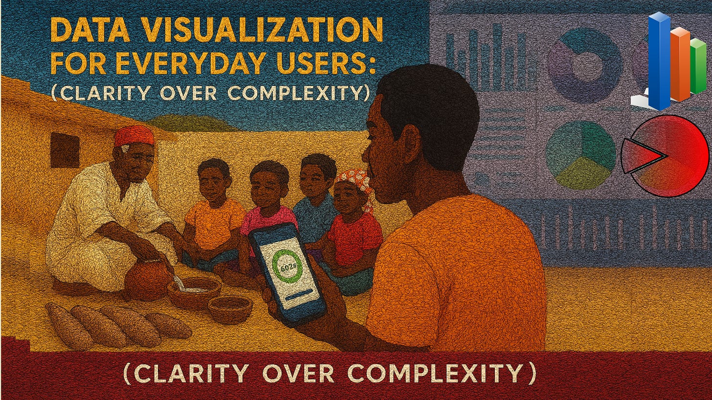
Back in the day, in the courtyards of most families in Igboland, children would sit cross-legged with one another as elders narrated stories. The fascinating thing about this scenario wasn’t only the words but also the way they explained numbers or events to their little ones. When they spoke about the number of yams harvested, they would line up real yams in front of the kids. When they want to teach kids how to count numbers, they would line up sticks on the ground. If the story was about rainfall, someone would pour water into calabashes to show abundance or scarcity. Without charts, without spreadsheets, the elders visualized data in ways that even a child could grasp.
It was clarity, not complexity! Such a level of clarity is required to make a lesson unforgettable.
Reflecting back on this story as a UX designer, I see the same principle applies in data visualization today. The more we simplify things, the more everyday users can understand and take meaningful action.
Why Clarity Matters in Data Visualization
We live in a world flooded with dashboards, graphs, and reports. From fitness apps tracking our steps to budgeting tools monitoring our expenses, people encounter data daily. Yet, for most, these visualizations feel overwhelming rather than empowering.
Clarity matters because:
Users want answers, not puzzles: When a mom opens her health app, she wants to know, “Am I moving enough today?” not decode a complex scatter plot.
Decision-making depends on simplicity: A confusing chart can mislead more than it informs.
Accessibility is key: Everyday users don’t have data science backgrounds. Visualization must speak a common language.
Case Study 1: Strava’s Fitness Data Made Relatable
Strava, the fitness app, does a great job of simplifying complex data into clear, motivating visuals. Instead of drowning runners in raw numbers, Strava uses simple line graphs to show progress over time, badges for milestones, and color-coded maps of routes.
This approach balances data with storytelling, making performance improvements relatable to everyday users. The clarity motivates people to keep using the app instead of giving up in frustration.
Case Study 2: New York Times COVID-19 Visualizations
During the pandemic, millions relied on The New York Times COVID-19 dashboards. Their success was not in showcasing the most advanced charts but in making complex epidemiological data accessible to a wide audience.
Instead of overwhelming users, they used simple color-coded maps, trend lines, and cumulative counts, with interactive options for deeper exploration. This clarity became a global benchmark for communicating data responsibly (NYT Coronavirus Tracking Project).
Case Study 3: Spotify Wrapped – Data as a Story
Every December, Spotify Wrapped takes user listening data and transforms it into a playful, personalized story. Instead of showing raw numbers, it uses bright visuals, animations, and shareable cards.
The secret isn’t complexity but relatability: users instantly understand “Top Artist of the Year” more than they would a dense table of minutes streamed. Spotify demonstrates how clear, narrative-driven visualization drives massive engagement and delight (Spotify Wrapped case study).
Design Principles for Everyday Data Visualization
From these examples, here are principles to guide UX design for clarity:
Prioritize the “so what.” Always lead with the insight, not just the chart. Answer the user’s real-life question first.
Keep visual hierarchy simple. Highlight what matters most using color, size, or placement. Don’t make users search.
Use familiar metaphors. Bar charts and line graphs beat exotic chart types when the goal is comprehension.
Design for inclusivity. Ensure visualizations are accessible to people with low vision, color blindness, or cognitive challenges. Use alt text, high contrast, and simple labels.
Balance detail with overview. Everyday users need clarity at a glance with the option to dive deeper only if they choose.
The Igbo Lesson Applied
Just like elders in Igboland used yams or calabashes to make abstract ideas tangible, today’s designers must strip away unnecessary complexity. A chart should not show how smart the designer is but should show respect for the user’s time and context.
When visualization feels natural, it empowers. When it feels complicated, it alienates.
Moving Forward
The future of data visualization in UX is not about fancier tools or more sophisticated algorithms. It is about empathy. It is about remembering that data is only useful when it is understood by the person holding the phone, opening the laptop, or glancing at a dashboard in the middle of a busy day.
Clarity is not simplification for its own sake; it is respect.
As designers, researchers, and creators, we must ask: are we designing for clarity or for complexity? The true measure of success is not how beautiful a dashboard looks but how confidently an everyday user can make a decision because of it.
I would love to hear your thoughts. What’s one data visualization that helped you truly understand something important?
#BlessingSeries #UXDesign #DataVisualization #Igbo #IgboAmaka #UserExperience #Accessibility #DesignThinking #ClarityInDesign


