
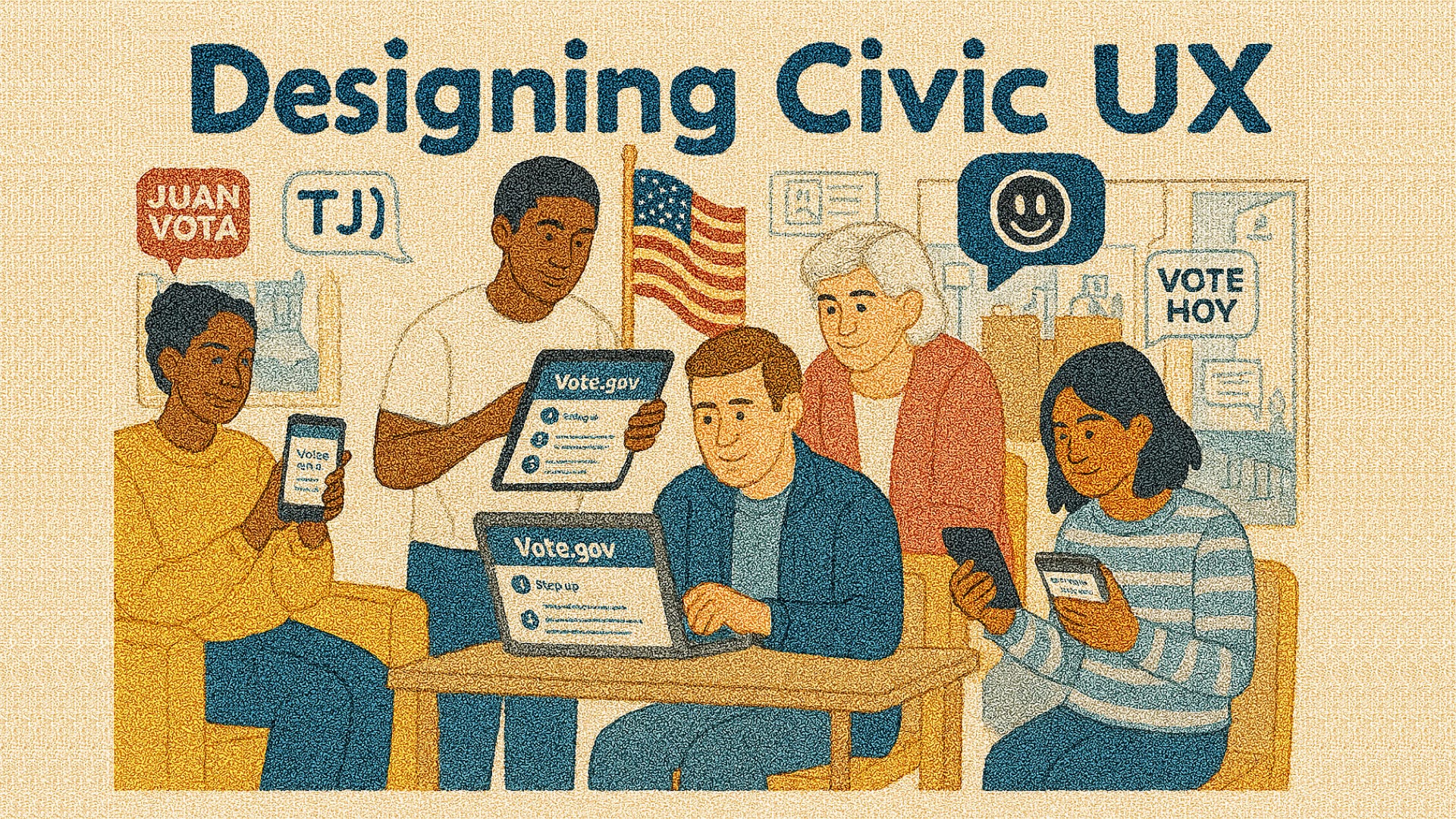
Designing Civic UX: How Vote.gov Simplifies Voter Access
Creating Digital Gateways That Make Democracy Easy, Accessible, and Inclusive

Growing up, elders would gather children under the shade of a large tree or around the warm glow of a lantern. They would recite stories of our ancestors, tracing genealogies, recounting civic duties, and teaching local laws. Every detail mattered. If someone skipped a step, misremembered a fact, or told a story incorrectly, the message lost its authority. We listened carefully, absorbed the nuances, and internalized the lessons. Accuracy, clarity, and accessibility were crucial for understanding and for taking action.
Today, digital civic tools carry the same responsibility. They must present information clearly, guide users step by step, and empower citizens to act. One of the most notable examples in the U.S. is Vote.gov, a centralized platform designed to make voter registration, absentee ballot requests, and state-specific voting instructions straightforward and accessible to all. It is the digital equivalent of those storytelling sessions: every click, every form field, every interaction is intentional and purposeful.
The Challenge: Making Voting Accessible
Voting is a fundamental right, yet millions of eligible Americans face barriers. State-specific registration rules, multiple deadlines, and scattered resources often intimidate first-time voters. In many cases, it’s not that information is unavailable; it’s that the UX is fractured and overwhelming. Websites are cluttered, forms are inconsistent, and instructions vary wildly between states. A study by Pew Research highlights that one-third of nonvoters cite confusing registration processes as a reason for not participating.
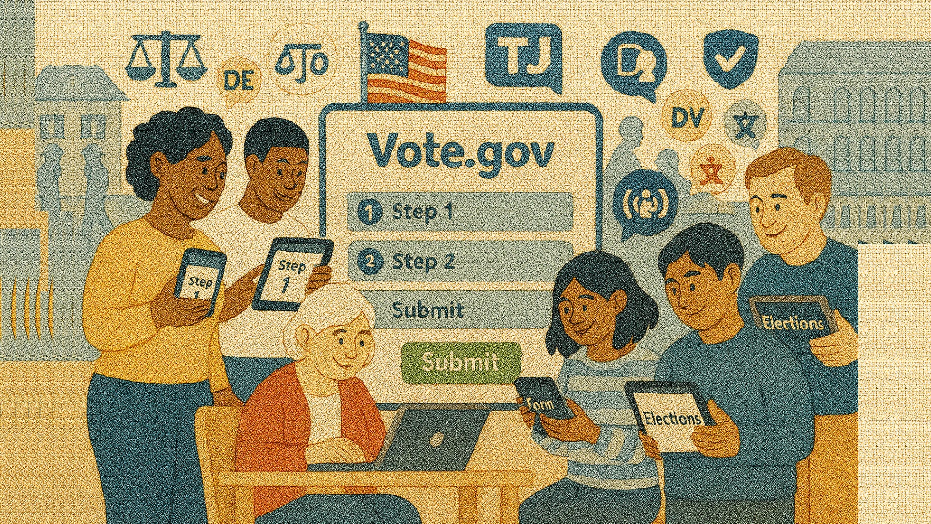
Vote.gov tackles these challenges head-on by creating a single entry point for voters nationwide, guiding users step by step and personalizing instructions based on their state. The goal is simple: reduce friction, eliminate confusion, and empower users to act.
Human-Centered Design in Civic UX
Vote.gov exemplifies human-centered design in civic contexts. The platform prioritizes clarity and usability over flashy design or unnecessary features. The homepage is minimal: a few key questions guide users to the right forms. Users are never bombarded with every possible feature at once. Instead, the platform progressively discloses options, showing only what’s relevant.
For example, someone living in California will only see California-specific registration instructions, deadlines, and absentee ballot guidance. Users in New York see different options. This ensures users are never overwhelmed, a principle validated in UX research on progressive disclosure (Nielsen Norman Group).
Step-by-Step Guidance for Reduced Cognitive Load
Vote.gov breaks down complex tasks into manageable steps. Instead of presenting a full registration form with dozens of fields and legal disclaimers, the platform asks a few simple questions at a time. Users progress through a linear flow, with each completed step unlocking the next. This approach reduces cognitive load, increases completion rates, and mirrors best practices in task-oriented UX design.
Building Trust Through Transparency
From my childhood story shared above, trust was earned through accuracy and consistency. Vote.gov applies the same principle digitally. Every form, deadline, and instruction links directly to official state resources, giving users confidence that the information is reliable. In civic contexts, where misinformation can have serious consequences, trustworthy design is essential. Users must feel confident that when they click “Submit” or “Register,” their action is valid and secure.
Mobile-First Design for Accessibility
Most first-time voters access the internet via mobile devices. Vote.gov adopts a responsive, mobile-first design. Key elements include:
Tap-friendly buttons and large input fields
Readable typography without zooming
Clean layouts that work in portrait and landscape orientations
These details may seem small, but in civic UX, they are critical for participation, especially among younger voters or those without access to desktop computers.
Inclusive Design Features
Vote.gov also implements inclusive design standards:
Screen reader compatibility: for visually impaired users
High-contrast mode: for users with low vision
Multilingual support: making civic participation accessible to non-English speakers
Intuitive Cues: Clear visual cues and intuitive navigation, ensuring that people of all technical abilities can complete registration successfully
Inclusive design in civic tools is not optional, it is essential for equitable access to democracy.
Encouraging Action Through Micro-Moments
Micro-moments are critical in UX design. They are small, actionable interactions that reinforce progress and build user confidence. Vote.gov embraces this by breaking the voter registration process into digestible steps, providing confirmation pages, and offering state-specific next steps after completing each action. These micro-moments mirror temporal UX principles, which ensure systems adapt based on user progress, creating momentum and reducing drop-offs.
Human-AI Collaboration in Civic UX
Some state election offices are experimenting with AI-powered chatbots to guide users through registration and absentee requests. These bots answer FAQs, provide contextual guidance, and surface direct links to official forms. By combining human-curated content with AI assistance, the experience resembles a modern version of an elder guiding children through a complex story: knowledgeable, contextual, and supportive.
Lessons Learned for Designers
Vote.gov offers several actionable lessons for UX designers:
Clarity over complexity: Only show what the user needs at that moment.
Step-by-step guidance: Break processes into manageable steps to reduce errors.
Accessibility is mandatory: Design for users with disabilities, low vision, or limited digital literacy.
Trust through transparency: Link to official sources and make actions verifiable.
Responsive design: Ensure mobile users have the same seamless experience as desktop users.
Micro-moments build confidence: Celebrate progress and make next steps obvious.
Human-AI collaboration enhances support: AI can assist without replacing human authority or context.
By following these principles, UX designers can empower users to take meaningful action, much like elders empowering children to understand their culture and civic duties.
Conclusion
Civic UX is more than just forms and buttons, it’s about enabling participation, building trust, and creating equitable access. Vote.gov shows how government services can embrace clarity, inclusivity, and human-centered design to make democracy accessible to all. When digital tools are thoughtfully designed, they can remove barriers, reduce frustration, and ensure citizens can act with confidence.
Designers have much to learn from this approach: transparency, stepwise guidance, mobile-first design, inclusivity, and micro-moments are all crucial when building digital civic experiences.
Whether you’re designing government tools or private digital services, think like a storyteller: every step should be clear, accessible, and trustworthy. Audit your flows, reduce friction, and empower your users to act confidently.
“If this post sparked something for you, I’d be grateful if you considered supporting my work. Every bit helps me keep writing, exploring, and sharing with you. Thank you for walking this journey with me.”
References
Hashtags: #BlessingNuggets #CivicUX #InclusiveDesign #DigitalGovernment #VoteAccess #UXDesign #HumanCenteredDesign #Accessibility #DesignForGood