Designing for Edge Cases: UX That Works When Things Go Wrong
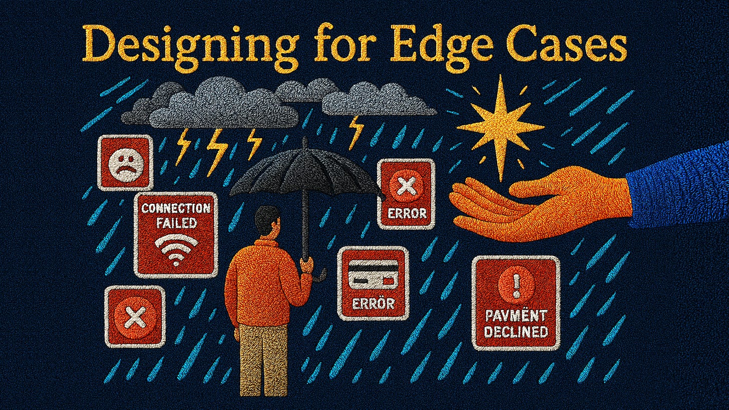
In my place, there is this adage that states, “Prepare the roof before the rain comes.” This doesn’t literally mean the weather. It means that life has a way of surprising us, and the best way to survive is to design with failure in mind.
Fast-forward to today, and that wisdom applies directly to UX. Because in design, things will go wrong. Internet connections drop. Payment cards get declined. Users forget passwords. APIs fail.
The true test of great UX isn’t how smooth things feel when everything works, it’s how supportive, clear, and human the experience feels when things break down.
Why Edge Cases Matter
Edge cases are those moments outside the “happy path.” Most teams design for the ideal user journey: browse, click, purchase, done. But real life is messy.
What happens when a user enters the wrong ZIP code?
Or when their battery dies mid-checkout?
Or when the system crashes while uploading an important document?
Ignoring these moments leads to frustration, mistrust, and abandonment. Designing for them builds trust, loyalty, and resilience.
Case Study 1: Google Gmail’s “Undo Send”
Think of how many times you’ve sent an email too quickly, maybe with a typo, maybe to the wrong person. Gmail recognized this edge case and introduced “Undo Send”, giving users a buffer to cancel.
This tiny feature became a game-changer because it solved a high-stress mistake with grace. Instead of punishing users, Gmail designed a safety net.
Lesson: Edge-case solutions don’t just fix errors, they reduce anxiety and empower users.
Case Study 2: Slack’s Friendly Error Messages
Slack's commitment to human-centered design and empathetic communication is a core part of its brand identity. This philosophy extends to every part of the user experience, including how they handle errors. Slack is known for its approachable, human-centered design language.
Their error messages are a prime example of this, aiming to reassure users and take ownership of the problem rather than placing blame on the user. When something goes wrong, like a lost connection or a failed upload, the error messages are empathetic, often with a touch of humor. Instead of cold, technical errors, users get messages like: “Something’s not working right now. We’re on it.” That kind of tone helps users feel supported rather than blamed.
Lesson: The tone of error handling can be just as important as the fix itself.
Case Study 3: Shopify Checkout Failures
For e-commerce, the checkout flow is critical. Shopify discovered that failed payments and unclear error messaging were causing cart abandonment. By redesigning their payment failure flows, providing clear next steps, retry options, and helpful hints, they significantly reduced drop-offs. This focus on edge cases added millions in recovered revenue for merchants.
Lesson: Designing for failures isn’t just about user satisfaction, it directly impacts business outcomes.
Patterns for Designing Edge Cases
Anticipate the Worst: Ask, "What could go wrong? Network? Input? System errors?" then plan for them.
Write Human Error Messages: Avoid jargon. Don’t say: “Error 504 Gateway Timeout.” Say: “We lost connection. Please refresh or try again.”
Offer Next Steps: Users should always know what to do next. Retry, go back, or contact support. Never leave them stranded.
Reduce Blame, Increase Empathy: Don’t make users feel at fault. Instead, acknowledge the system’s role.
Build Safety Nets: Like Gmail’s “Undo Send” or autosave in Google Docs, add features that protect users against common mistakes.
Test Beyond the Happy Path: Usability tests should include failure scenarios. What happens if the user enters an invalid phone number?
A Modern Parallel: Banking Apps and Error UX
Think about banking apps. When you transfer money, there’s often no room for error. That’s why many banks now use confirmation screens, fraud alerts, and step-by-step feedback loops.
Designers realized that in high-stakes contexts, clear edge-case handling prevents panic, builds trust, and reduces costly mistakes.
Why Edge Cases Build Trust
When things go wrong, users are at their most vulnerable. A supportive UX response tells them:
“We expected this could happen.”
“You’re not alone.”
“Here’s how to fix it.”
And that, right there, is how trust is built, not on the sunny days, but in the stormy ones.
Bringing It Back to My Adage
Remember the adage about preparing before the rain? Designing for edge cases is just that.
If we only design for the perfect sunny-day journey, we risk losing people the moment the storm hits. But if we anticipate, plan, and design for breakdowns, we turn potential disasters into moments of care and loyalty.
Next time you’re mapping a user journey, don’t stop at the happy path. Ask yourself: “What happens when things go wrong?” Then design for it.
Because trust isn’t built when everything goes right, it’s built when things go wrong, and you still make users feel supported.
References
#BlessingSeries #UXDesign #EdgeCases #ProductDesign #HumanCenteredDesign


