
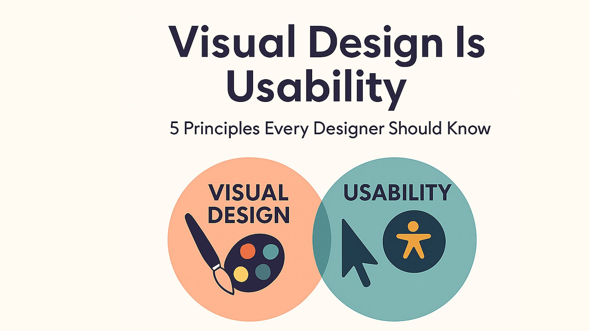
Visual Design Is Usability: 5 Principles Every Designer Should Know

In a small town library, an elderly reader quietly closed a digital reader app. “I had to squint to read it, and every chapter looked the same,” she said.
That wasn’t just a glitch; it was a poor visual design.
Great design isn’t just about looking good, it’s about making products usable and engaging. Visual design directly impacts how users perceive and interact with our products. It isn’t just decoration. When done well, it guides, comforts, and clarifies so readers, shoppers, students, or patients can focus on what matters, not how it looks.
Here are 5 essential principles every designer should master to create intuitive and effective experiences:
These powerful principles bridge beauty and usability
Scale: Use size to signal importance. Larger elements catch attention and establish a clear visual hierarchy, guiding users effortlessly. Make important things stand out by size. Use just a few sizes: title, headline, and body text to show what’s most important.
Visual Hierarchy: Organize content so users naturally know where to look first, next, and last. This reduces cognitive load and improves navigation. Lead the eye in the right order: big title, medium subhead, small details. This helps people “see what to do next” without thinking.
Balance: Achieve harmony by distributing visual weight evenly. Balanced designs feel stable and trustworthy. Create a stable visual feel by spreading visual weight evenly, not perfectly, but harmoniously.
Contrast: Make key elements stand out through differences in color, size, or shape. Contrast not only draws attention but also improves accessibility. Make sure light and dark, color and background are distinct. It’s not just pretty; it’s usable, especially for older eyes.
Gestalt Principles: Leverage how humans perceive groups and patterns to simplify complex layouts, making interfaces easier to understand. We naturally group related items:
Proximity: related things go together.
Similarity: similar things feel connected.
This makes pages feel intuitive, not random.
Why this matters
When design is thoughtful, people don’t look at it, they use it. They can read, focus, and trust the experience without asking, “What does this mean?”
Real-world Examples
Think of Google’s homepage: a single search box, minimal distractions.
Or emergency alerts on your phone: bold copy, high contrast, instant clarity.
They apply these principles to make the experience clear, fast, and humane.
So the next time you’re picking a font size or arranging buttons, remember:
Design isn’t just art. It’s understanding.
Applying these principles doesn’t just create beautiful interfaces; it enhances usability and user satisfaction. As our UX expert Don Norman says, design works best when it connects on visceral, behavioural, and reflective levels.
And when we use scale, contrast, hierarchy, balance, and Gestalt, we help real people. Everyone from grandparents to first-time users feels seen, respected, and guided.
That’s not just pretty. That’s useful.
— Blessing
Digital Product Designer | UX Storyteller | AI Explorer
#BlessingNuggets #VisualDesign #UXDesign #DesignPrinciples #HumanCenteredDesign #AccessibilityMatters #DesignThinking #UIUX #ProductDesign #FigmaDesign #Usability #TechForGood #WomenInTech